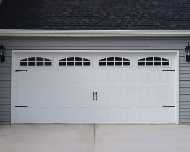
How to match your garage door colour to your home’s exterior
A garage door is often the largest visible surface on a home, yet many owners choose its finish as an afterthought. Seen from the street, it can either blend into the architecture or compete with it. The colour should support the home’s overall character, improve street presence and suit local weather, not simply follow the latest trend.
The process behind How to Match Your Garage Door Color to Your Home’s Exterior begins with the colours, materials and architectural details already present. Consider the roof, wall cladding, window frames, front fence and surrounding landscape as a combined palette. This approach makes it easier to choose a garage door finish that looks deliberate from every angle.
Start with the colours already on the house
Begin by identifying the dominant exterior colour, then note the supporting shades used for trims, doors and window frames. A brick home may have charcoal windows, a terracotta roof and natural sandstone details. A contemporary property might rely on white render, dark cladding and muted natural tones. These combinations provide a reliable starting point for garage door color matching.
Decide whether the garage door should blend or contrast. A similar colour creates a calm, continuous facade and makes the opening appear less dominant. A contrasting shade can establish a stronger focal point, especially when the house has restrained landscaping and simple architecture. For extra visual direction, browse current colour references before narrowing the palette.
Read the architecture and local setting
Architectural style influences which colours feel proportionate. Federation homes often suit deep heritage greens, muted blues, creams and timber tones, while modern coastal houses commonly suit pale greys, whites, soft blues and understated metallics. The garage door should reflect the home’s era without turning it into a period replica.
Sydney sandstone terraces provide a useful example. Warm cream or grey finishes can complement the stone, while deep green or navy can give a dark-fronted terrace a confident street presence. In Melbourne, where rendered cottages and red-brick homes sit beside weatherboard and modern extensions, the safest choice usually comes from the materials nearest the garage rather than a universal colour rule.
Brisbane’s strong subtropical sun can make very dark finishes look harsh and cause colours to fade more quickly, so lighter shades are often easier to maintain. Perth homes near pale limestone and bright limestone-toned streetscapes also benefit from softened whites, stone, sand and muted grey-blue. These local references matter because identical colour samples can behave differently under Australian light.
Compare popular finishes and materials
Colorbond and other pre-painted steel garage doors are widely available in the Australian market. They offer a broad range of durable, low-maintenance colours and work well with brick, render and contemporary metal cladding. Powder-coated steel provides another versatile option, while timber-effect panels can introduce warmth without requiring a solid timber door.
The material affects how a colour reads. Timber grain adds texture and visual depth, so a restrained paint colour may appear richer than it does on a smooth steel panel. Aluminium doors offer clean lines and a modern appearance, often with neutral finishes that coordinate easily with architectural screens. A faux timber finish should be assessed in daylight because its brown tones can vary considerably between showroom lighting and direct sun.
Matching and contrasting both have merit. Matching the garage door to the front door can unify a narrow entry, while contrasting it with the garage door can make the entrance clearer. Use one or two repeated colours instead of forcing every exterior element into exact agreement, as small differences in texture and finish often provide welcome visual interest.
Test the colour in real conditions
Request physical samples whenever possible and place them against the cladding, front door and roof. View them in morning light, strong afternoon sun and overcast conditions. Colours such as pale grey, beige and white can pick up reflections from paving, while dark shades may absorb heat and appear much warmer than they did indoors.
Ask for a full-size panel image or photograph of the proposed door on a similar home. A small square sample does not show how horizontal panel lines, window sections or raised sections affect the overall colour balance. It also helps to view the finish from the driveway, where most people first encounter the garage.
Colour selection should sit alongside proper care, particularly on doors exposed to rain, dust and changing temperatures. This winter garage door care guide covers practical checks for hinges, seals, tracks and weather protection, helping both the finish and the operating parts remain in good condition.
Coordinate every visible detail
The door colour should work with its hardware and glazing. Black or charcoal rollers, handles and window frames give a crisp, modern appearance, while bronze, chrome and antique brass can suit timber, traditional and heritage homes. Coloured glazing can soften a bold door, although its tint should be tested alongside the exterior rather than selected independently.
Also consider the driveway, fence, house numbers and planting. Pale paving makes darker doors look sharper, while a driveway in warm sandstone or brick supports earthy shades. For a double garage, horizontal panel designs and window placements can reduce its visual width or create a balanced relationship with the second storey.
Check the proportions before approving the colour. A very dark door on a wide, plain facade may feel heavier than intended, while a light door with extensive glazing can disappear against a pale wall. The best result considers colour, panel design, architectural mass and the amount of glass visible from the street.
Use a practical selection checklist
Before ordering, work through the following checks with the designer, supplier and, where relevant, your architect or building adviser.
- Build a physical palette using samples of the roof, cladding, trim, front door and paving, then place the garage door sample beside them.
- View every candidate colour at several times of day and in both direct sunlight and overcast conditions, checking for strong reflections or unexpected colour shifts.
- Compare the proposed panels on a full-size image, paying attention to panel lines, window sections, decorative mouldings and the door’s visual width.
- Select the finish for the exposure as well as the appearance, considering UV resistance, coastal conditions, humidity and the level of maintenance the home can support.
- Coordinate hardware, glazing, weather seals and decorative trim so the smaller parts of the garage door reinforce the chosen exterior palette.
- Confirm the colour, finish, panel design and measurements in writing, using metric dimensions and the supplier’s daylight viewing conditions before production begins.
Tape the shortlisted samples to the garage opening and photograph them from the approach used by visitors. This simple test can reveal problems that a supplier’s showroom cannot, especially when the house has deep shadows, bright neighbouring walls or strong afternoon glare. Keep the samples until the final selection is signed off.
Bring the whole frontage together
A well-matched garage door colour connects the architecture rather than isolating the opening. It can echo the roofline, clarify the entrance, balance a wide facade and give the front of the property a more intentional appearance. The strongest result comes from combining the right colour with suitable panels, durable materials and careful attention to local conditions.
Explore the garage door design ideas, material guides, sizing advice and local repair resources, then choose a colour based on the whole home. Take your selected samples, measurements and exterior references to the next planning conversation, and order only after the complete frontage looks balanced.